Ever struggled with how to make your images and text stand out together without worrying about heights & margins, or padding? Let’s do it in flex with a few lines of code.
Step 1: Set Up the Structure
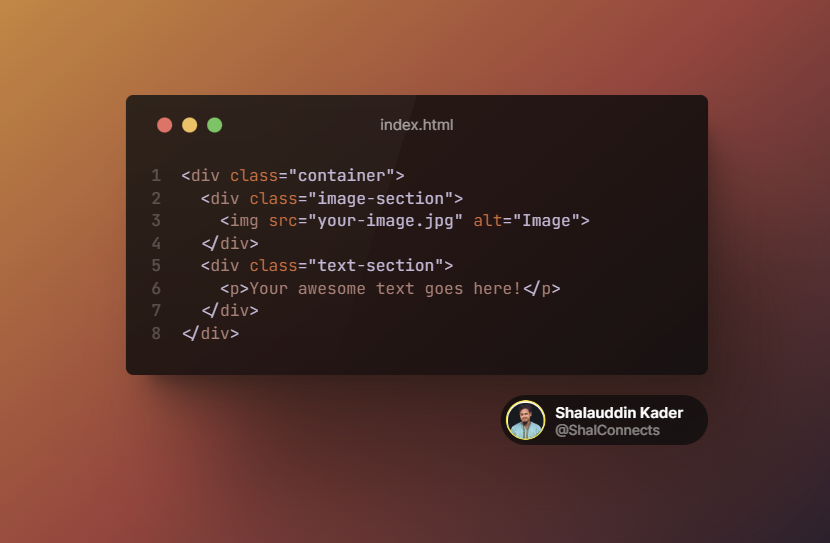
We’ll use HTML and CSS to achieve this layout. In your HTML file, create a container to hold your image and text sections side by side:

Step 2: Add CSS Flexbox Magic
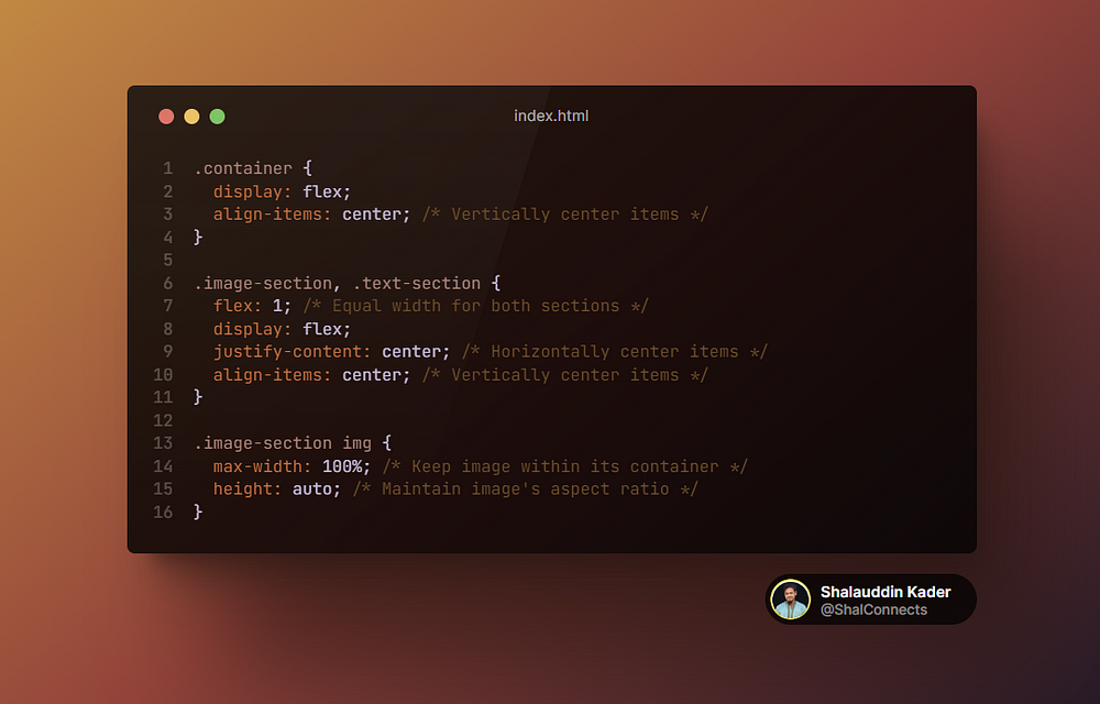
Now, it’s time to sprinkle some CSS magic using Flexbox. This helps us achieve that fantastic alignment. In your CSS file, let’s style things up:

Step 3: Voila, Marvel at the Magic!
With these simple steps, your image and text will now be perfectly aligned side by side. The image will adjust to its natural height, and your text will always look great, no matter how much you write.